heat map (heatmap)

What is a heat map (heatmap)?
A heat map is a two-dimensional representation of data in which various values are represented by colors. A simple heat map provides an immediate visual summary of information across two axes, allowing users to quickly grasp the most important or relevant data points. More elaborate heat maps allow the viewer to understand complex data sets.
A heat map is a way to represent data points in a data set in a visual manner. All heat maps share one thing in common -- they use different colors or different shades of the same color to represent different values and to communicate the relationships that may exist between the variables plotted on the x-axis and y-axis. Usually, a darker color or shade represents a higher or greater quantity of the value being represented in the heat map.
For instance, a heat map showing the rain distribution (range of values) of a city grouped by month may use varying shades of red, yellow and blue. The months may be mapped on the y axis and the rain ranges on the x axis. The lightest color (i.e., blue) would represent the lower rainfall. In contrast, yellow and red would represent increasing rainfall values, with red indicating the highest values.
The changing colors across the two axes will reveal patterns in one or both variables and whether there are relationships between them. Thus, there may be blues on the heat map for some months, indicating that rainfall was in the lower range(s) in these months. A few yellows and reds for some other months would show higher rainfall for those months. From this simple heat map, any user can see how much rain the city received in each month and whether it was higher or lower than the rainfall in other months.
Grayscale heat map vs. rainbow heat map
There are many ways to display heat maps and a variety of color schemes can be used to represent them. The two most common schemes are grayscale and rainbow. Grayscale heat maps originated in the 19th century and are still in use today. In a grayscale map, lighter shades of gray are usually used to represent lower values in the data set, while darker shades, including black, indicate higher data values.
Rainbow-schemed heat maps use more colors to indicate the various values in a data set. Warmer tones like red and orange usually indicate higher data values, while cooler tones like blue and green represent lower data values.
Both kinds of heat maps can be created manually. However, today, it is more common to use software to create heat maps for various applications and use cases. Some of the most popular heat map software applications include the following:
- Hotjar.
- VWO.
- Mouseflow.
- Smartlook.
- Plerdy.
- Lucky Orange.
- Heatmapper.
- Glassbox.
Today, AI-generated heat maps are also available. These maps visually represent data and generate insights that enable users to both understand "what is" and predict "what could be." For example, website designers can use AI-generated website heat maps to see what users are paying attention to on the site and also predict where they are likely to pay attention to in the future.
Benefits of heat maps
The values represented on a heat map would normally be much harder for a human to understand if presented numerically in a spreadsheet, especially if the data set is large or complex. Another way of saying this is that a heat map enables viewers to visualize data and understand it easily.
Since heat maps are fairly self-explanatory, complex or detailed data analysis is generally not required. Therefore, any user can gather insights from it and even see key trends from the data set. Also, heat maps can be combined with other types of data visualization to display important data insights to a viewer at a glance.
Common example of a heat map
In the United States, many people are familiar with heat maps from viewing television news programs. For instance, during presidential elections, many news programs show geographic heat maps, usually with the colors red and blue superimposed on a map of the country.
On the map, red usually represents the Republican Party, so these states are known as red states. Conversely, blue represents the Democratic Party, so these states are known as blue states. By showing these colors on each of the 50 states, viewers can quickly see which party is dominating or winning in each state.
Heat maps for monitoring website user behaviors
One common application of heat maps is to analyze user behavior on a website in web analytics. A heat map can show which part of the website most users are clicking on, which elements they are tapping on and where they stop or pause scrolling.
In general, a website heat map reveals behavioral insights about how users generally act on the website, how they navigate and where they spend the most time. Webmasters can use these insights to determine if any changes or improvements are needed to keep more users on the site to, say, reduce bounce rates or increase conversions.
The two most common types of heat maps used in website design and analysis are interaction heat maps and attention heat maps. Interaction heat maps use tracking codes to record the interactions between the website and its users, whereas attention heat maps monitor user eye movements (head tracking) to understand which website content and pages users look at the most.
Other types of website heat maps include the following:
- Click maps. These maps show where users clicked on the website's pages, allowing webmasters to understand how people use the various pages and the elements on each page, and if there are navigational issues.
- Scroll maps. Scroll maps show site visitors' scrolling behavior and enable webmasters to determine the ideal length and content type for various webpages.
- Mouse-tracking heat maps. These maps show mouse hover patterns, which can reveal areas of visitor friction and enable webmasters to take action to optimize the website.
Other applications of heat maps
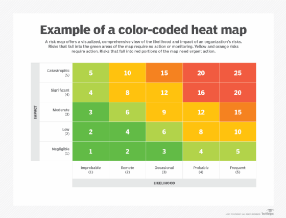
Apart from websites, heat maps can be used for any application where there is a need to observe patterns or identify relationships between two variables. The various cells in the heat map are colored based on the value in each cell. These values can be numeric or qualitative. Examples of the latter would be "low, medium, high" and "low risk, high risk, extremely high risk."
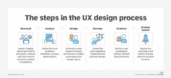
Heat maps are increasingly being used in user experience (UX) design. A UX heat map visually shows the state of user experiences so designers can determine if any changes are required to improve experiences and enhance customer satisfaction and happiness.
Product designers also use heat maps to improve certain elements of the product and to identify elements that may be important but are currently being overlooked. Heat maps are also useful for understanding how the product stands in comparison to competitor products.
Heat maps are useful in marketing and advertising, especially for gauging the effectiveness of ads. Marketing and advertising professionals can also use heat maps to assess marketing and ad spending, determine the placement of call-to-action text (or buttons), and choose the right creatives for promotional activities.
Other common applications of heat maps include the following:
- Retail. To analyze foot traffic in retail stores by hour, day, week or month and improve resource allocation for high-traffic locations
- Manufacturing. To monitor and optimize the performance of production bays in terms of defects, production count, downtime or other factors.
- Population studies. To understand various parameters of a population, such as per-capita-income or employment rate.
Learn about top data visualization techniques and how to best use them, check out 8 steps to improve data visualization literacy and see how to evaluate and select data visualization tools.