
business intelligence dashboard
What is a business intelligence dashboard?
A business intelligence dashboard, or BI dashboard, is a data visualization and analysis tool that displays on one screen the status of key performance indicators (KPIs) and other important business metrics and data points for an organization, department, team or process. Dashboards are an integral component of most BI software platforms and are used to deliver analytics information to business executives and other employees.
These tools are also sometimes referred to as business dashboards, business intelligence tools or data dashboards. They typically contain multiple data visualizations to give users a combined view of relevant KPIs and trends for both operational decision-making and strategic planning.
BI dashboards are more interactive than static BI reports, usually enabling users to access the data that underlies charts and graphs for further analysis. In some cases, dashboards are designed by the members of a BI team; in others, they're created by business analysts and other users of self-service BI tools.
BI dashboard features and components
In addition to support for interactivity, essential features of modern BI dashboard software include a customizable interface, dashboard templates to accelerate the design process and the ability to pull in both historical and real-time data. Dashboard tools offer libraries of widgets, icons and images that can be added to dashboards to automate functions and improve usability and visual appeal. They also have useful tabs, drop-down menus and other navigation features.
This article is part of
Ultimate guide to business intelligence in the enterprise
The primary components of designed dashboards include the following items:
- Connections to data sources. Depending on the data that users need to see, BI dashboards can be connected to data warehouses, data marts and data lakes -- the most common analytics data stores. They can also be connected to operational systems, industrial equipment and external data feeds for more up-to-date information.
- Data visualizations. Dashboards can be configured with various types of data visualizations to show different performance metrics, statistics and other information. Supported visualizations range from basic line and bar charts to more elaborate graphics, such as bubble charts, heat maps and scatter plots.
- Data tables. BI dashboards can also incorporate tables of data that provide an at-a-glance look at relevant data values. The tabular data often includes color coding or other graphical treatments to highlight specific information, such as to flag a decline in sales or financial losses.
- Drill-down capabilities. This feature enables users to get more information or look at and analyze detailed data by clicking on a data visualization. Doing so takes them to additional visualizations or data tables, often arranged in a hierarchical fashion so users can drill down multiple levels if they want to.
- Data filters. Filters are another interactive feature, letting users customize date and time ranges, geographic settings and other parameters in data visualizations to get a more focused view of the information being presented.
- Text boxes and tooltips. Dashboards often include standalone text boxes and pop-up information tooltips that explain the data being visualized or provide additional information and context about the analytics results.
Benefits and limitations of BI dashboards
BI dashboards are increasingly seen as critical tools to help enterprises derive valuable business insights from their growing storehouses of data. Businesses today often have big data sets that combine the structured data commonly used in BI applications with unstructured and semistructured forms of data. Well-designed dashboards provide the following business benefits:
- Enabling more informed decisions and strategic planning by business executives.
- Making number-intensive data and business analytics metrics easily comprehensible for users who aren't skilled analysts.
- Helping identify business trends so an organization can take action to capitalize on opportunities and address problems.
- Easing the deployment and use of self-service BI applications by business analysts, managers and workers.
- Supporting more collaborative data analysis and decision-making processes through increased information sharing.
- Providing multiple data visualization possibilities to make data more understandable and useful.
But dashboards also pose challenges for both BI teams and business users. The potential drawbacks of BI dashboards don't necessarily result from the design of the software, but rather from how dashboards are used and the cost of creating, implementing and maintaining them. In many enterprises, BI and IT professionals still design and update dashboards for users. They're also responsible for documenting dashboards and tracking their usage.
Other challenges that organizations face in building effective dashboards include the following:
- Having overly flashy or cluttered dashboard designs that make dashboards hard to use.
- Embedding too much visual information and not constraining the associated raw data to what's needed.
- Failing to provide context to make it clear how KPIs and other data are relevant to end users.
- Difficulty in creating drill-down paths to plumb the data underlying surface metrics.
- Misrepresenting data in dashboards or leaving out relevant data, leading to inaccurate analytics.
BI dashboard design best practices
A good dashboard design presents business insights derived from data in a way that's easy to understand. In a well-designed dashboard, the different components seamlessly mesh with one another to provide views of the data that give end users actionable insights for data-driven decisions and operational tasks, while also allowing them to drill down to see more granular data if needed.
In general, dashboard design best practices include the following:
- Involve end users in the BI dashboard design process.
- Refine designs during development using an iterative approach.
- Precisely identify the data that the intended users need to track.
- Allow for customization of dashboards by different parts of an enterprise.
- Don't overdo the amount of information being presented to users.
- Keep the data in BI dashboards current and up to date.
- Include consideration of user experience issues, with upfront testing to identify any problems.
Some consultants recommend that BI and analytics teams adopt a methodology similar to the software development lifecycle for designing dashboards. Doing so formalizes project management steps on BI dashboard design, from identifying business requirements for dashboards to assessing data quality, creating and testing initial designs, modifying them as needed and documenting finished dashboards.
BI dashboard examples and use cases
Organizations deploy a variety of operational and analytical dashboards to support decision-makers at all levels in an enterprise. The following are common types of BI dashboards designed for various functions:
Sales and marketing dashboards
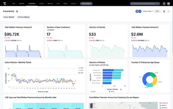
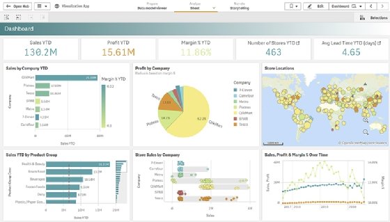
Business executives, managers and sales and marketing teams use this type of dashboard. A sales dashboard includes data on products or retail sales, the cost of sales operations and other KPIs. They help users track progress against sales goals and identify potential trouble spots. Similarly, a marketing dashboard contains data on costs, response rates, lead generation and other marketing metrics.
Customer dashboards
A customer dashboard lets users view and analyze data about an organization's customer base, including its size, churn and retention rates, revenue per customer, lifetime value and other customer metrics that can be used to help plan marketing campaigns and sales efforts.

Financial dashboards
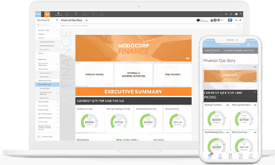
This type of dashboard displays data on financial KPIs for the chief financial officer, other managers and employees in the finance department. The metrics in a financial dashboard range from revenue, operating expenses and profits to others such as cash holdings, assets and liabilities. They help organizations monitor business performance and do financial planning and analysis.
Human resource dashboards
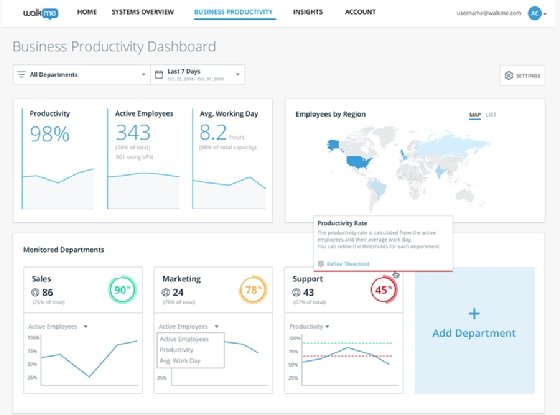
A human resource (HR) dashboard provides relevant information on an organization's workforce for use by HR managers and business executives. That includes basic workforce data -- such as the number of employees, salary statistics and demographics -- as well as hiring and recruiting metrics and KPIs on areas such as employee satisfaction, turnover and costs. This data is used to assist with talent management and employee experience initiatives.
Operational dashboards
These dashboards track the status of operations, business processes and equipment on an ongoing basis for day-to-day monitoring and management. For example, an operational dashboard might show metrics on the output of manufacturing machines to help plant managers ensure that production goals are met and identify potential problems or bottlenecks that they need to address.
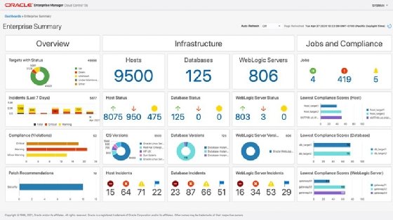
IT dashboards
IT departments are big users of dashboards, along with BI, data management, data warehousing and data science teams. IT dashboards track metrics on various aspects of IT operations, including the use of networks, systems, databases and applications; available IT resources; performance problems; security issues; and technology costs.
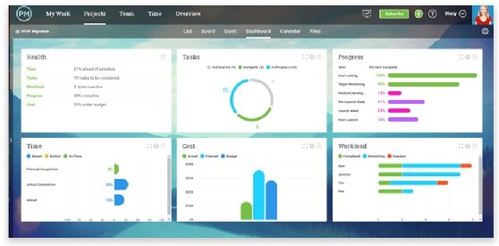
Project dashboards
A project or project management dashboard displays data on the status and progress of business projects. Project managers use them to track tasks, deadlines, costs and other parameters that aid in monitoring work, spotting problems and keeping projects on schedule and budget.
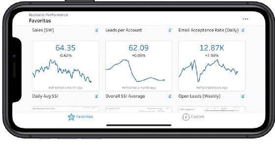
Mobile dashboards
This isn't an entirely separate dashboard category; many BI dashboards are designed for both PCs and mobile devices. However, dashboard designers looking to support mobile BI users must ensure that dashboards display in a readable way on smartphones and tablets. As a result, mobile dashboards are often relatively simple, with a few data visualizations that can be easily viewed on a small screen.
BI dashboards vs. BI reports
BI dashboards and BI reports appear to serve a similar purpose on the surface, but they have key differences and serve different purposes. These distinctions include the following:
- Use cases. Businesses can typically give anyone access to their dashboards if certain metrics and insights are needed to guide their duties. However, reports are better suited for analysts and other experts who are expected to perform detailed analyses and extrapolate more information from closer scrutiny.
- Size or length. A dashboard is normally built to have its metrics, widgets and other elements fit within a single webpage or mobile screen. A report might cover several or many pages because data is often presented in spreadsheets, and more space is needed for detailed visualizations.
- Depth. A glance at a business dashboard is often all that's needed for certain tasks, such as monitoring for changes in a metric. A report usually goes more in-depth, presenting complexities that a dashboard can't show in a single webpage or screen.
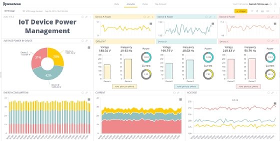
- Updates. Real-time data is easily monitored using dashboards. For example, the data transmitted from an IoT device measuring water quality or air temperature fluctuates constantly, and dashboards are ideal for keeping tabs on such data. Reports focus on past data and must be updated every so often.
- Filtering for specificity. Dashboards usually don't have filtering capabilities that allow users to focus on specific data, but reports are ideal for filtering so certain data elements or insights can be zeroed in on.
- Alerts and notifications. Alerts can be sent from interactive dashboards to a user's email address, for example, when a certain metric crosses a specific threshold. Reports aren't meant to send alerts or notifications. They require readers to determine the best courses of action for themselves.
BI dashboard vendors and products
Major vendors of modern analytics and BI platforms offer BI dashboards and dashboard design tools as part of their product lineups. That includes IBM, Microsoft, MicroStrategy, Oracle, Qlik, Salesforce, SAP, SAS, Sisense, Tableau and Tibco. Salesforce now owns Tableau but also still sells its own BI tools developed before the 2019 acquisition.
Dashboards are also available from dozens of other BI software vendors, including dashboard and data visualization specialists such as Dasheroo, Databox, Datapine, Geckoboard, Grow, Idashboards, InfoCaptor, Klipfolio and Target Dashboard. The products offered by those companies enable users to pull data on KPIs from operational databases, business applications, web analytics tools and other sources into dashboards, often without the need to do any coding.
Some BI vendors -- for example, Tableau and Microsoft with its Power BI platform -- support multiple levels of product licensing. Some users in an organization can get a license that allows them to create a BI dashboard and publish and share it, while others have a less expensive view-only license that doesn't include data analysis and dashboard design capabilities.
Dashboards are also embedded in many business applications, such as financial, HR and project management software. That enables business users to view KPIs and analyze data in the same application they use to do their job, without having to switch to a separate BI or reporting tool.
History and evolution of BI dashboards
The first BI dashboards were created in the 1970s as part of business decision-support systems, a forerunner of modern BI tools designed for corporate and business executives to use. Early dashboards typically were static and included relatively simple charts and graphics, including dials and indicators similar to the ones on car dashboards to show the status of operational KPIs.
Dashboards were also a core feature in executive information systems, a more advanced data analysis and reporting technology that was developed in the 1980s. They were commonly called executive dashboards, a term that's still used today to refer to BI dashboards built for CEOs and other C-suite executives.
In the 1990s, dashboards evolved into more functional and broadly useful tools with the emergence of BI software, data warehouses and online analytical processing engines. Together those tools expanded the types of data analytics applications that organizations could deploy.
The introduction of self-service BI and data visualization tools in the mid-2000s accelerated the evolution of today's interactive dashboards. Self-service and visualization tools let end users design and publish their own BI dashboards.
In real-world scenarios, businesses often require up-to-the-minute business intelligence to avert disruptions. Find out seven other benefits of BI dashboards for businesses.