data visualization
What is data visualization?
Data visualization is the practice of translating information into a visual context, such as a map or graph, to make data easier for the human brain to understand and pull insights from. The main goal of data visualization is to make it easier to identify patterns, trends and outliers in large data sets. The term is often used interchangeably with information graphics, information visualization and statistical graphics.
Data visualization is one of the steps of the data science process, which states that after data has been collected, processed and modeled, it must be visualized for conclusions to be made. Data visualization is also an element of the broader data presentation architecture discipline, which aims to identify, locate, manipulate, format and deliver data in the most efficient way possible.
Data visualization is important for almost every professional discipline. Teachers use it to display student test results, computer scientists to explore advancements in artificial intelligence (AI) and executives to share information with stakeholders. It also plays an important role in big data projects. As businesses accumulated massive collections of data, they needed a way to get an overview of their data quickly and easily. Visualization tools were a natural fit to provide useful information.
Visualization is central to advanced analytics for similar reasons. When a data scientist is writing advanced predictive analytics or machine learning algorithms, it's important to be able to visualize the outputs to monitor results and ensure that the models are performing as intended. Visualizations of complex algorithms are generally easier to interpret than numerical outputs.
Why is data visualization important?
Data visualization provides a quick and effective way to communicate information in a universal manner using visual information. Business professionals have different areas and levels of expertise, but visualizations are meant to be understandable by anyone. Visualizations make it easier for employees in an organization to make decisions and act based on insights derived from them.
Visualizations help businesses in many ways. Some examples include the following:
- They help isolate factors that affect customer behavior.
- They identify products or services that need to be improved.
- They make data more memorable for stakeholders.
- They help organizations understand when and where to place specific products.
- They can predict sales or revenue volumes.
Benefits of data visualization
The benefits of data visualization include the following:
- Actionable insights. A broad spectrum of an organization's personnel can understand visuals presented in business intelligence dashboards. This lets users absorb information quickly, get better insights and figure out the next steps faster.
- Exploration of complex relationships. Visualization platforms with advanced capabilities can display complex relationships among data points and metrics, allowing an organization to make faster data-based decisions.
- Compelling storytelling. Data dashboards that are visually compelling will maintain the audience's interest with information they can understand.
- Accessibility. Visualization tools make data more accessible and understandable, so that laypersons or semi-technical users who aren't data scientists can interpret and analyze it.
- Interactivity. Interactive dashboards have the functionality to allow users to click on various aspects of data displays to get more information. This is especially useful for those with less expertise on the subject area covered by the data. Static displays don't allow this.
Disadvantages of data visualization
While data visualization comes with many advantages, it can also pose several challenges, including the following:
- Complexity. A highly complicated visualization could appear cluttered or make it difficult to glean valuable insights. More complexity also means users need training on the tools being used or risk creating the wrong visual type for the data being used.
- Potential for misinterpretation. Users might have good intentions when using a visualization platform, but they can draw incorrect conclusions from detailed visualizations.
- Data privacy and security. Users must consider the security and privacy of the data being visualized. A platform might be susceptible to cyberattacks, thus compromising the security of data being used, or a data set could be used that isn't compliant with data privacy regulations.
- Bias. Visualizations and the data they're based on should be scrutinized to ensure they aren't intentionally or unintentionally biased. Failing to do so could compromise the credibility of those analyses. For example, a data set that leaves out key demographics within a population could lead to a biased visualization of that data.
Data visualization and big data
The increased popularity of big data and data analysis projects has made visualization more important than ever. Companies are increasingly using machine learning to gather massive amounts of data that can be difficult and slow to sort through, comprehend and explain. Visualization offers a way to speed up the process and present information to stakeholders in ways they can understand.
Big data visualization often goes beyond the typical techniques used in normal visualization, such as pie charts, histograms and graphs. Data visualization can provide more complex representations, such as heat maps and fever charts.
While big data visualization projects have become increasingly useful in recent years, there are disadvantages, including the following:
- Human intervention. To get the most out of big data visualization tools, it might be necessary to hire a visualization specialist. These experts can identify the best data sets and visualization styles to help an organization make good use of its data.
- IT resources. The visualization of big data requires powerful computer hardware, efficient storage systems and might entail cloud migration of data. These additional resources mean more IT involvement as well.
- Data integrity and security. The insights provided by big data visualization will only be as accurate as the information being processed. Large volumes of data typically require people and processes in place to govern and control the data quality and metadata. These people and processes must also ensure trusted data sources are used and that the data remains secure.
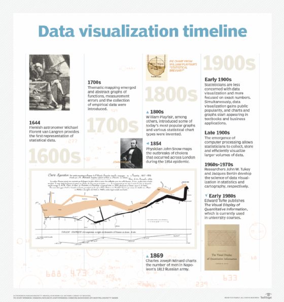
Examples of data visualization
When computers were first applied to data visualization, one of the most common visualization techniques was using a Microsoft Excel spreadsheet to transform the information into a table, bar chart or pie chart. While these visualization methods are still used, more intricate techniques are available, including infographics, bubble clouds, bullet graphs, heat maps, fever charts and time series charts.
Other popular types of visualizations include the following:
- Line charts. These charts are among the most basic and common techniques used. Line charts display how variables can change over time.
- Area charts. This visualization method is a variation of a line chart. It displays multiple values in a time series -- or a sequence of data collected at consecutive, equally spaced points in time.
- Treemaps. This method shows hierarchical data in a nested format. The size of the rectangles used for each category is proportional to the percentage of the whole each represents. Treemaps are best used when multiple categories are present, and the goal is to compare different parts of a whole.
- Population pyramids. This technique uses a stacked bar graph to display the complex social narrative of a population. It's best used when trying to display the distribution of a population.
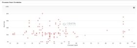
- Scatter plots. This technique displays the relationship between two variables. A scatter plot takes the form of an x- and y-axis with dots to represent data points.
Common data visualization use cases
Use cases for data visualization include the following:
- Sales and marketing. Market and consumer research firm eMarketer estimated $264 billion would be spent on U.S.-based digital advertising in 2023. That number is expected to cross the $390 billion mark by 2027. Given the size of the investment in advertising, marketing teams must pay close attention to their sources of web traffic and how their web properties generate revenue. Data visualization helps to illustrate how marketing efforts affect traffic trends over time.
- Politics. A common use of data visualization in politics is a geographic map that displays the candidates' states, counties or other geographic regions voted for.
- Healthcare. Healthcare professionals frequently use choropleth maps to visualize important health data. A choropleth map displays geographical areas or regions that are assigned a certain color in relation to a numeric variable. Choropleth maps allow professionals to see how a variable, such as the mortality rate of heart disease, changes across specific geographic areas.
- Scientists. Scientific visualization, sometimes referred to as SciVi, allows scientists and researchers to gain greater insight from their experimental and other collected data.
- Finance. Finance professionals must track the performance of their investment decisions when choosing to buy or sell an asset. Candlestick charts are used as tools to help finance professionals analyze price movements over time, displaying information such as securities, derivatives, currencies, stocks, bonds and commodities. By analyzing how prices have changed over time, data analysts and finance professionals can detect trends.
- Logistics. Shipping companies use visualization tools to create a data-driven supply chain and determine the most efficient shipping routes.
- Data scientists and researchers. Data professionals typically build visualization for their own use or to present the information to a select audience. They use visualization libraries of the chosen programming languages and tools. Data scientists and researchers frequently use open source programming languages -- such as Python -- or proprietary tools designed for complex data analysis. Data scientists and researchers use visualizations to get a greater understanding of data sets and to identify patterns or trends that might otherwise go unnoticed.
The science of data visualization
The science of data visualization is based on an understanding of how humans gather and process information. Daniel Kahneman and Amos Tversky collaborated on research that defined two different methods for gathering and processing information.
The first method focuses on thought processing that is fast, automatic and unconscious. This method is frequently used in day-to-day life and helps accomplish tasks including the following:
- Reading the text on a sign.
- Solving simple math problems, like 1+1.
- Identifying where a sound is coming from.
- Riding a bike.
- Determining the difference between colors.
The second focuses on slow, logical, calculating and infrequent thought processing, as demonstrated by the following:
- Reciting a phone number.
- Solving complex math problems, like 132 x 154.
- Determining the difference in meaning between multiple signs standing side by side.
- Understanding complex social cues.
Data visualization tools and vendors
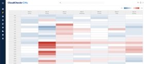
Data visualization tools can be used in a variety of ways. The most common is a business intelligence reporting tool. Users set up visualization tools to generate automatic dashboards that track company performance across key performance indicators and visually interpret the results.
The generated images also include interactive capabilities, enabling users to manipulate them or look more closely into the data for in-depth analysis. Indicators alert users when data has been updated or when predefined conditions occur.
A business might implement data visualization software to track its own initiatives. For example, a marketing team might use such software to monitor the performance of an email campaign, tracking business metrics, such as the open rate, click-through rate and conversion rate.
As data visualization vendors extend the functionality of these tools, they're increasingly being used as front ends for more sophisticated big data environments. In such a setting, the tools help data engineers and scientists track data sources and do basic exploratory analysis of data sets prior to or after more detailed advanced analyses.
Forbes has compiled a list of some data visualization software vendors and tools useful to small businesses. These include Domo, Kilpfolio, Looker, Microsoft Power BI, Qlik Sense, Tableau and Zoho Analytics. While Microsoft Excel continues to be a popular tool for data visualization, other tools have been created to provide users with more sophisticated and far-reaching capabilities.
Data visualization is a subset of the broader concept of data analytics. Learn the different ways in which advanced analytics tools drive business value.