
Fotolia
BI vendors aim to ease visual data analysis by business users
Despite the self-service BI push, enabling end users to take the lead on analyzing and visualizing data is often still a challenge -- one that vendors continue to address.

As analytics teams look to make it easier for business users to analyze and visualize data on their own, more BI vendors are adding visual data analysis capabilities designed to meet those needs -- and new software releases from GoodData and Periscope Data provide fresh evidence.
GoodData last week launched a UI design framework called Spectrum for use with its embedded BI and analytics platform. The additions include a JavaScript library that BI developers can use to build custom applications with built-in data visualizations, plus functionality for creating alert-driven dashboards and enabling end users to visually explore data sets prepared for them by data analysts.
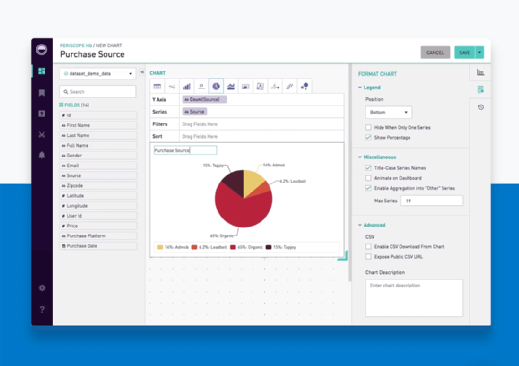
A week earlier, Periscope Data also rolled out new features that let business users analyze curated data sets in its data modeling and analytics platform. Instead of looking at static charts and dashboards, users can now tap a visual query editor with a drag-and-drop interface to create their own data visualizations without having to do any SQL coding.
Visual data analysis has been a trending topic for years, with self-service BI tools like Tableau, Qlik Sense and Microsoft's Power BI setting the pace. Gartner again listed interactive visual exploration as one of the core capabilities of modern BI and analytics platforms in its 2018 Magic Quadrant report on them, published in February. However, making the use of BI software in business operations more pervasive -- and more user-driven -- remains a challenge in many organizations.
Room to grow on visual data exploration
For example, Fivestars, which runs a customer loyalty program for local businesses, has 10 Tableau users -- but they're data analysts who do "heavy-lifting analytics" with the software, said Matt Curl, the San Francisco company's vice president of business operations. Periscope Data's platform offered less of a learning curve for business users as a data visualization and dashboard tool, Curl said. On the other hand, end-user data exploration in it has largely been limited to people with SQL skills, he added.
 Matt Curl
Curl, who manages data infrastructure and analytics at Fivestars, said he sees "a lot of upside potential" for using Periscope's new capabilities to expand visual data discovery and analysis by end users. As a trial, he built a table that holds data on the use of the Fivestars program by ZIP code; business managers can drag and drop the different data elements they want to examine into a chart template.
That gives the end users more control over the analytics process than they get in a set of dashboards Curl's team built to track key business metrics and company initiatives. "It lets them look at what they want to look at when they want to look at it," without having to call the data analysts for help or deal with "a wall of text in SQL," he said.
Fivestars runs the Periscope Data platform on top of a repository from Treasure Data that pulls together data from 20 or so source systems for analysis. Curl is still assessing the new visual data analysis technology, but he expects to use it in real applications at the company, which is formally known as Five Stars Loyalty Inc. "The early signals are that people like it," he said.
Periscope Data CEO Harry Glaser said the new features are meant to give business users "a sort of mini-Tableau" to explore data sets curated for them by data management and analytics teams. From a competitive standpoint, he added, they're aimed at putting the San Francisco-based vendor on an equal footing for end-user analysis and visualization with Looker Data Sciences, its closest rival.
Not just a job for data scientists
GoodData's Spectrum framework is similarly designed to enable users of its embedded BI software to do ad hoc visual data analysis and track key performance indicators (KPIs) in interactive dashboards. That's in addition to GoodData.UI, the new JavaScript library based on React, an open source library created by Facebook. It gives developers access to thousands of visual components that can be incorporated into applications; they can also use D3.js and other visual libraries to design custom visualizations.
GoodData, also based in San Francisco, hopes Spectrum's UI design features will grease the skids for broader use of its software by business managers and workers who aren't particularly data savvy. "Not everyone is cut out to be a data scientist, or even a citizen data scientist," CEO Roman Stanek said.
Those are precisely the kinds of users Zalando SE wants to reach with an analytics service that the Berlin-based online retailer is testing with about 185 product companies. Zalando, which sells shoes, clothing and beauty products in 15 European countries, has embedded GoodData's software into the Consumer Insights service's web portal to visualize data on sales and customer buying behavior for brand managers, marketers and other outside users.
 Cody Alton
Initially, the GoodData platform offered "a really quick way for us to visualize sort of standard information," said Cody Alton, product manager for the service. Zalando began using GoodData.UI as a beta tester early this year, and the JavaScript library makes it easier to visualize data in different ways, according to Alton. He said that's an important capability for his team, which is looking to make data visualizations "more playful and interactive" to better engage users of the service.
"We want to represent data in a way that isn't complicated and seems a little fun," Alton said. For example, that might mean "calling out one number they're interested in, instead of listing 150," he added. Doing so could also help Zalando justify the cost of the analytics service, which will be offered in two versions: a free one that tracks a few basic KPIs, and a paid one with a much broader set of metrics.