
agsandrew - Fotolia
6 big data visualization project ideas and tools
These data visualization project examples and tools illustrate how enterprises are expanding the use of "data viz" tools to get a better look at big data.

Enterprise analytics and data visualization has traditionally been performed by data analysts to get insights into sales, efficiency, operations or to improve customer behavior. These tools have been adapted for use by more types of people who have found new uses for data visualization.
These six big data visualization project examples and tools illustrate how enterprises are starting to expand the use of these tools to get a better look at the data they collect.
1. Bring big data visualization up front
Enterprises are finding ways to create data visualization front ends that can be explored by front-line workers.
"We've seen interesting examples of enterprise employees creating long-form data stories with rich narratives and interactive visualizations that guide their stakeholders toward insights that support high-impact business decisions," said Nick Mihailovski, lead product manager for Data Studio at Google.
Rather than have developers create a purpose-built app, enterprises can wire up Google's Data Studio to their data sources, then create and style a simple UI with Analytics Canvas.
Another exciting area is the intersection of self-service and enterprise BI. Traditionally, central teams control BI usage, but increasingly, companies are enabling entry-level users who are closer to business problems to use BI tools on their own. Using enterprise-level auditing, central teams can scale globally while ensuring the proper governance and security is in place, Mihailovski said.
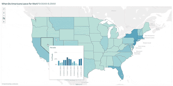
2. Connect time and space
Another promising data visualization project with big data analytics is location intelligence, which makes sense of patterns that span time, space, and customer behavior.
"Location intelligence is more than visualizing information on a map," said Nima Negahban, CTO and co-founder of Kinetica, a big data analytics provider. "It allows businesses to drill down and analyze location and time data together to better understand the entity that is most valuable to them."
Marketers use location intelligence to understand consumer preferences, behavior or loyalty based on when, where and how often someone shows up. Customer support managers use location intelligence to create better customer experiences, since physical location is usually a big part of servicing a customer -- from predicting arrival, delivering timely solutions to urgent issues and routing. Business development teams use location intelligence to reduce risk for future investments, such as where to open a new store, where to drill a new well, or where to construct a new cell tower.
3. Visualize the voice of the employee
Data visualization can also be used to make sense of data related to the voice of the employee, said Dave Marko, managing director, on-demand analytics and information management for Acumen Solutions, an IT services management consultancy.
Large organizations realize that employee turnover is a problem, but they struggle to shift to a more personalized and prescriptive engagement strategy. With a higher demand on skilled resources, increased attrition, and costly hiring and on-boarding processes, U.S. businesses are losing millions to tens of millions of dollars every year due to turnover.
Some employee experience elements that Acumen has built visualizations for include employee interaction analysis to visualize the drivers and satisfaction across multiple channels and workforce landscape analysis to understand workforce makeup and which types of employees are more or less loyal.
The ability to predict employee attrition also allows employers to prevent high turnover. These tools identify who is most at risk, when they are at risk, and what can be done to change that outcome before an employee decides to leave the company. In addition, performance analytics can be used to identify the specific attributes behind top-performing employees who stay longer compared to attributes of lower performers who leave sooner.
4. Map data visualization to the real world
In general, visual analytics experts recommend focusing on simple charts and lines to make it easier to tease apart relationships between elements in big data. But, Pratik Jain, technical architect at Kyvos Insights, said there are other ways to visually map data, in the same way the human mind works.
Jain described a data visualization project on flight seat analysis for a major airline. Using seat booking data from millions of transactions, the team built a visualization shaped like an airplane with the exact seating arrangement as the actual aircraft. The seats that generated more revenue appeared darker in the visualization, helping the airline identify profitable seats that could bepriced higher, along with the poorly occupied ones that needed promotions. These visualizations were interactive and could be analyzed across several parameters to get deeper insights.
In another data visualization project, this one for a major car manufacturer, Jain wanted to depict how wheel balancing impacts insurance costs. In this case, the visualization was made to look like a car where the amount of imbalance for each tire was represented by the degree to which the tire was angled. This visualization mapped millions of rows of data from service reports and insurance costs, helping them conduct instant comparisons against threshold lines and assess the value of future insurance premiums.
5. Improve supply chain management
Mobis Parts Australia, an auto parts manufacturer, needed a new analytics and reporting platform that would support real-time reporting on inventory, sales performance and vendor pricing, and predict future demand and sales. The tool had to offer robust business intelligence functionality and integrate seamlessly into the day-to-day operations of a broad network of internal users, vendors, and dealers. Most importantly, it had to be appealing and easy to use or users would be reluctant to adopt this new tool and share their updates with the rest of the company.
The company adopted the OpenText Analytics platform to provide clearer, more current views into things like shipping times or inventory levels of a specific part, which let them make more accurate analyses and predictions.
6. Identify workflow bottlenecks
Managers in virtually every enterprise spend a lot of time and attention trying to plan how long new projects will take. When projects are delayed, a lot of frustration can go into figuring out where workflows get stuck. A wealth of big data about workflow bottlenecks is often buried across various enterprise applications and tools.
Tasktop, a value stream mapping tool provider, looks at how to structure this data to create visualizations which improve communications across the enterprise.
"The amounts of enterprise data have been growing at such a rate that I find the most interesting and useful tools to be the ones that help structure the data," said Mik Kersten, CEO of Tasktop and author of "Project to Product: How to Survive and Thrive in the Age of Digital Disruption with the Flow Framework."
Once the data is structured in a way that is meaningful to the business, it becomes much easier to use the many analytics and visualization tools and packages available today. In theory, the process of adding the right structure to the data is a modeling process. But it can be difficult to model data after it has been created. Also, it can be a maintenance nightmare if the schemas of the underlying data are changing.
Agile and DevOps tools for rapidly building and delivering software have highly structured data that CIOs and other IT decision makers want insight into. These data models, however, constantly change as development teams evolve their toolchains and the way they work to be more efficient and responsive to customer needs. Tasktop works to solve this issue with a modeling layer connected to the tools themselves, like Atlassian Jira for planning and ServiceNow for ITSM.
"It is amazing how much easier visualization becomes with this kind of natively-connected modelling layer, and I believe we will start seeing similar approaches adopted in other domains where re-structuring data after the fact becomes prohibitive to effective visualization," Kersten said.